
Analyze
Understand how Sessions perform on a Map — bottlenecks, duration stats, and workload trends.
The Analyze view shows how Sessions have performed on a Map over time: where work stalls, which stages run long, how Session durations distribute, and who carries the load. Use it after Sessions have completed to find improvement opportunities and close the Map → Execute → Store → Analyze loop.
Switching Modes
Every published Map has three modes, accessible via a segmented toggle in the top bar:
| Mode | Purpose |
|---|---|
| Build | Design stages, transitions, Map Roles, and blocks |
| Facilitate | Monitor live Sessions, act on individual Sessions, triage support threads |
| Analyze | Understand historical patterns — bottlenecks, durations, workload trends |
Click Analyze in the toggle to enter the analytics view. Facilitate and Analyze are available only on published Maps.
When you switch between modes, your camera position (zoom and pan) is preserved — the transition feels like switching a lens on the same Map rather than navigating to a separate page. Session and stage selections also carry across between Facilitate and Analyze.
Time Range
All metrics in the Analyze view are scoped to a time range. The selector in the panel header offers four presets: last 7 days, 30 days, 90 days, and all time. Changing the range updates the graph overlay, summary metrics, and session list together.
Time-range-scoped views are shareable: the range, selected stage, and panel state are all encoded in the URL, so you can link a colleague to "this Map, last 30 days, Review stage selected."
The Analytics Graph
The Analyze graph shows the same Map layout as Build and Facilitate, but with analytical data overlaid on each node.
| Element | What it shows |
|---|---|
| Count badges | Active and completed Session counts for the selected time range, shown top-left on each node |
| Heatmap coloring | Node background shaded from cool (fast stages) through warm to hot (slow stages), based on average dwell time |
| Duration label | Average completion time for the stage, shown at the bottom of the node |
| Bottleneck indicator | A thicker border on the slowest stage in the Map |
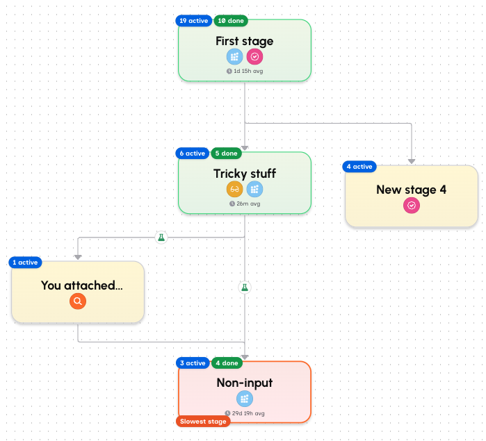
The heatmap gives you a thermal picture of the Map at a glance — hot nodes are where time goes. Click any node to see detailed metrics for that stage (see Stage Detail).
Session path highlighting
When you select a Session from the Sessions panel, the graph switches to show that Session's path: completed stages with checkmarks, the active stage with a green border, and pending stages dimmed. Duration labels swap from the aggregate average to that Session's actual dwell time at each stage, and assignee avatars appear on the nodes that Session touched.
The Side Panel
The side panel has two tabs: Summary (📊) and Sessions (📋). The panel header also holds the time range selector and an export button.
Summary
The Summary panel is the default view — it answers "how are Sessions on this Map doing?" with metrics scoped to the selected time range.
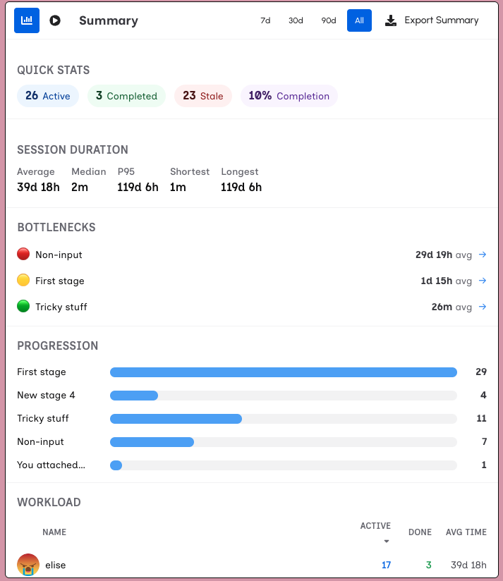
Headline metrics — Active, completed, and stale Session counts, plus the overall completion rate.
Duration stats — Average, median, P95, shortest, and longest Session durations. P95 surfaces worst-case performance: if most Sessions complete in two days but one in twenty takes two weeks, that shows up here.
Bottleneck ranking — Stages ranked by average dwell time, from slowest to fastest. Color indicators match the graph heatmap (red for the slowest, green for the fastest). Each row is clickable — clicking a stage opens the Stage Detail view, the same view you reach by clicking the node on the graph.
Progression funnel — How many Sessions are at each stage, ordered by graph distance from the start. Shows where Sessions accumulate in the pipeline.
Workload distribution — Per-person completed count and average completion time. Shows who carries the most work and whether anyone is significantly slower or faster than the team average.
Role activity — Per-role active Session counts. Shows which Map Roles are busiest.
Stage Detail
Click a graph node or a row in the bottleneck ranking to see that stage's metrics. The stage detail replaces the Summary panel content; click ← Back to return.
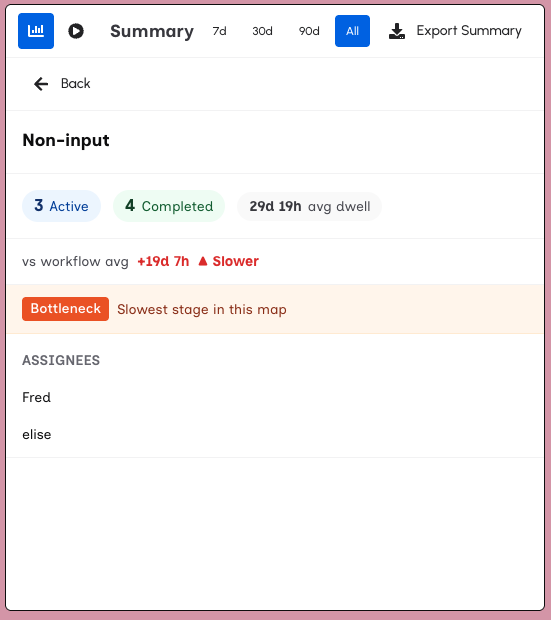
The detail view shows:
- Stage name and completion policy
- Active and completed Session counts at this stage
- Average dwell time with a comparison to the Map average (e.g. "+2.3d ▲ Slower" or "−1.1d ▼ Faster")
- Bottleneck banner — appears when this is the slowest stage in the Map
- Assignees — people who have been assigned to this stage
Sessions
The Sessions tab shows individual Sessions in a sortable list, scoped to the selected time range. Sort by status, start date, or idle time to surface the Sessions you care about.
Click a Session row to select it. The graph updates to highlight that Session's path, and the panel switches to a Session detail view.
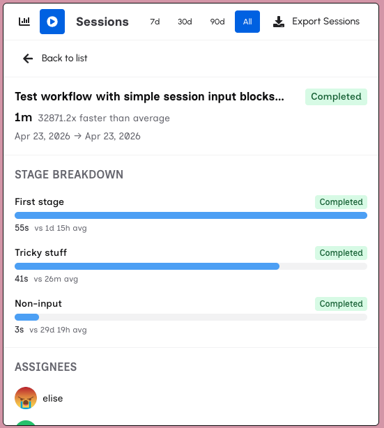
Session detail shows where that Session's time went:
- Header — Session name, status, total duration, and a comparison to the Map average (e.g. "1.8× slower than average")
- Stage-by-stage breakdown — Each stage the Session visited, time spent, and a comparison to the stage average. Stages where this Session spent disproportionately long are highlighted
- Session metadata — Start and end dates, stages visited, and assignees
Click ← Back to return to the session list.
Export
The panel header includes an Export button. On the Summary tab it exports the displayed metrics as CSV. On the Sessions tab it exports the session list with durations and status.
See also: Live session monitoring in Facilitate, structured data in Sheets, or the full flywheel in Core Concepts.